Top Ten Tuesday is sponsored by The Broke and The Bookish. I often have trouble coming up with a total of ten for the top 10, and today is no different, but the book I finished yesterday isn’t published till next year, so I can’t post my review just yet. But I like this topic this week, and I do have 8, some of them are series, so I’ll count those to make up for the 2 I don’t have.
This book hasn’t been released yet, so maybe they’ll change it. And I guess it does kind of have to do with the story. I just don’t like it. Sorry.
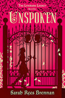
Now, I do love the cover, and I do think it is pretty but there is just something that makes it seem like it is for more of a middle grades reader than a high school/teen reader. The 2nd book in the series I do like the cover better. And while I know again, this cover has to do with the story, I just am not a fan.
The problem I had with the original cover wasn’t that it wasn’t attractive. I mean it grabs your attention. But, it really had nothing to do with the book in my opinion. It was just another generic girl in a beautiful formal dress, but why? The newer covers, and the paperback of this one, are much better.
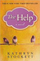
The cover of this one is one of the main reasons I wasn’t ever interested in reading it. That is until I saw a preview for the movie, that told me what it was about, and then I was very intrigued. I’d say again it is a cover that doesn’t really have much to do with the story.
So in this case, I loved the original hardback cover that you see on the left. The one on the right is cool, and makes sense with the story, maybe more than the first one, but once I’d already seen the first one, and loved it, it was just kind of plain to me. And then the rest in the series ended up looking like the paperback cover, so it seems that we missed out on what might have been some more intriguing covers.
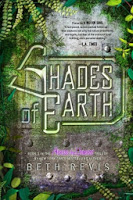
Something similar happened with the Across the Universe series from Beth Revis. Only we had the really beautiful covers for the first two books, which changed for the paperback, okay, I know that happens. But then when the 3rd one came out, it got the same type of cover as the paperbacks, and no beautiful cover like the first two hardcovers.
This is the same thing as with Nightshade, you had a beautiful cover that really grabbed your attention, and then it went to this boring picture of a generic girl’s face in paperback. The rest of the series followed suit, so no more of the original type of cover.
Now while I do actually like the newer series covers on the right, I already had all of the original covers. Not only that, but they changed the title of the book! What in the world is the point of that?
So, I really only have 8 listed, but for some of them, the series, there is more than one book in the series that I don’t like the cover for, so I’ll count it at 10. What about you? What do you think of my choices? Do you have any books that you wish you could change the cover of?
While you’re here, don’t forget to join my
November is for Novellas Challenge and try to get some of those cleared off your TBR lists, and maybe off your e-readers this month!








I'm with you–I'm so tired of publishers taking really unique gorgeous covers and then changing them to something just like everything else on the market: Delirium, Nightshade, Sisters Red. Why do they do that to us?? I agree with you on Liv Forever–not a fan of that one.
Why must they mess with what is already so great, and what we already associate with our beloved books? Oh well, they don't seem to ask us. 🙂 Thanks for stopping by!
I have to agree with you about The Help. It hasn't got the best cover, but it's actually one of my favourite books! So weird.
I loved The Help as well! Just don't like the cover at all. Thanks for stopping by!
Good call on Unspoken. It does make it seem younger.
Thanks! It's not a bad cover, just doesn't do what I think it needs to.
I like the redesign of Shatter Me. I wasn't unhappy with the original cover, like you, but the new covers are so much more attention-grabbing. It stands out and there's nothing like it.
Thanks for stopping by!
Aly @ My Heart Hearts Books
Glad to hear you agree! Thanks for returning the favor!
I actually love the cover of Unspoken and was disappointed with the cover change, haha. The original cover of Nightshade is much cooler (though I haven't read the books, so I can't say which reflects the books better!).
Thanks for stopping by my TTT!
I know a lot of people did love the cover of Unspoken, so I hesitate to name it, but I just felt it was too young. Thanks for stopping by my post as well!
The Across the Universe was such a strange shift! The original covers were so popular, I just don't understand why the publisher didn't realise a pretty third hard cover.
And the new Shatter Me and Delirium covers are terrible. Just how are readers supposed to get a sense of what the story is about?
I like the new Shatter Me covers because they're not the same as a ton of other ones, but I agree that they don't really give you an idea of what they are about.
Some really great picks! The Help cover is pretty dull, so is the UK cover that I have; so glad I gave it a try anyway! My TTT.
Yeah, again, we shouldn't be judging by the cover, but if you get no idea of the story from that, it often keeps you from picking it up. Thanks for stopping by!
The Help cover is really boring. I wouldn't know what the book is about with that cover.
I know, which is probably why I never picked it up until I saw the movie review. I don't always want to read what is popular.